For this project, I had the opportunity to design a website for a company that makes your sleepover feel like magic. I had complete freedom to design it the way I wanted, as long as it matched the styling of their logo and pictures. Here beside me are some of the final screens of the website. I'm really pleased with the result and glad I could assist this company!
Check out the website here!

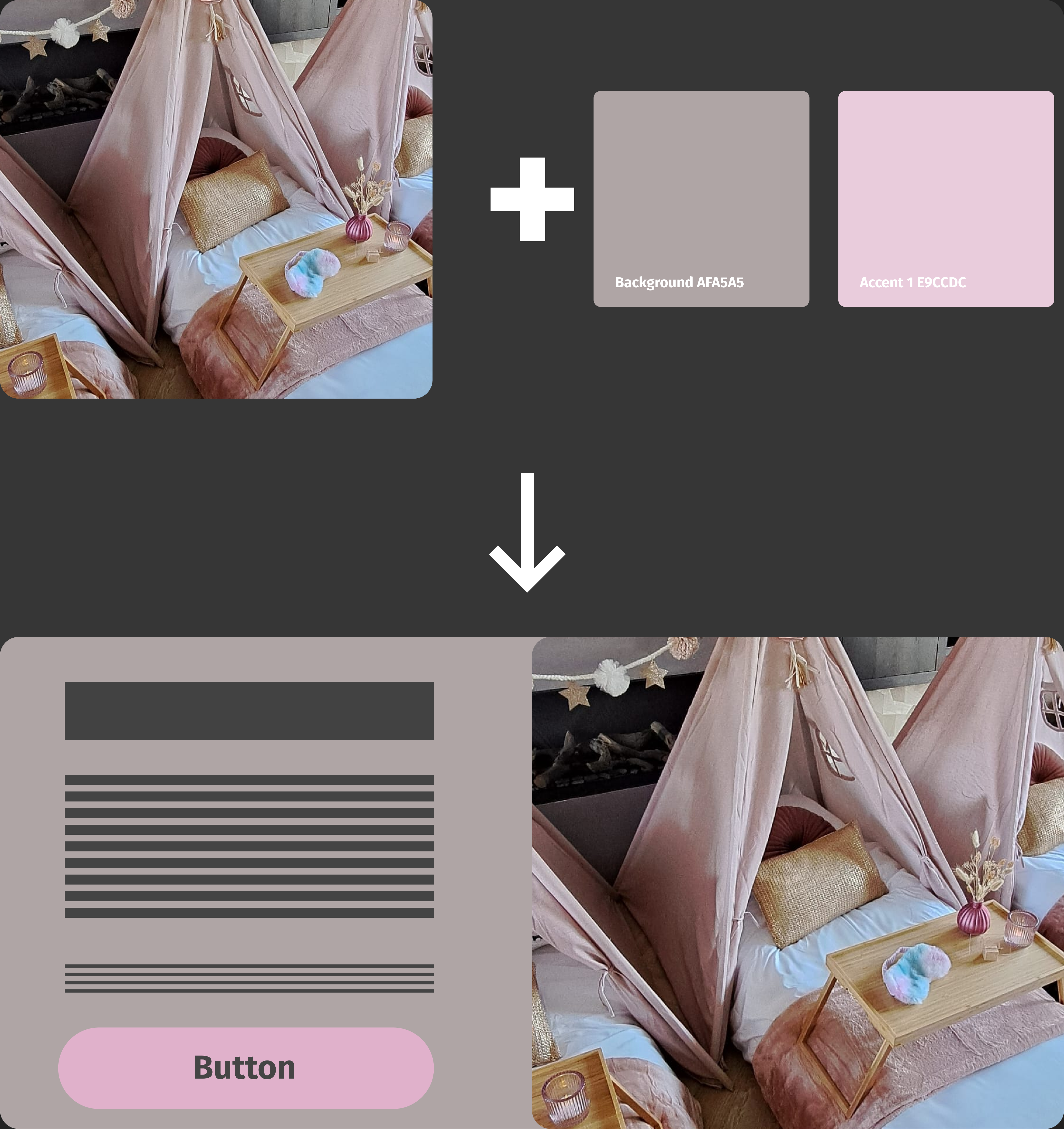
To determine the main styling of the website, I aimed to match the colors as closely as possible to those featured in their products. I extracted the colors from the picture you see beside me for the accents and background, and made slight modifications to ensure they looked appealing on a website. Next, I created a simple wireframe page to share with the brand owner, allowing them to assess the color approach. Following their feedback, the design phase proceeded.